Every Man Utd Third Kit of the Premier League Era - Ranked

Manchester United released their new third shirt for the 2020/21 season this week, a bold black and white design that seeks to put a modern twist on traditional stripes.
The striking jersey is also inspired by a rarely talked about history of stripes in United kits, from those worn in the early 20th century more than 100 years ago, to the more subtle black stripes that featured on several white away jerseys in the 1970s and 1980s.
This season's effort is the 17th different third kit that United have launched in the Premier League era. Here's a closer look back at the previous 16, ranked from worst to best...
*this list only includes kits originally released as ‘third’, and not away kits that subsequently became designated third strips in later seasons
16. All-Blue w/Red (2014/15)
Blue has long been a popular away colour for United, tied into club history because of the all-blue strip worn in the 1968 European Cup final. But the 2014/15 version didn’t work, with something abut the dark back, buttons and red trim not quite right.
15. Trinity Tribute (2017/18)
United’s third shirt in 2017/18 was the result of a fan competition and paid tribute to the club’s iconic ‘Trinity’ – Bobby Charlton, George Best and Denis Law – who are immortalised in statue form outside Old Trafford. In reality, it promised much more than it delivered.
14. Navy Blue w/Red (2000/01)
United didn’t much wear their navy blue third kit in 2000/01, which used a colour scheme that could easily have doubled as a France international strip thanks to the red socks. It is most often seen in clips of Thierry Henry’s famous flick and volley in a game against Arsenal.
13. White & Red/Black Hoops (2003 - 2005)
Horizontal black and red pinstripes added a little bit of subtle intrigue to the otherwise white third shirt debuted in 2003, and was occasionally used until 2005. Black was United’s primary away colour at that time and there wasn’t much call to wear this.
12. All-Blue w/Black (1997 - 1998)
United didn’t actually launch this all-blue third kit with black and white trim until the latter stages of the 1996/97 season, having actually worn an older third kit earlier in the campaign. It is one of the handful of United shirts that has used a central badge.
11. White w/Navy Blue (1999/00)
United’s away and third kits in the 1999/00 season marked the club’s first foray into monochrome badges, which have become a common feature of change stripes over the last five years. This shirt was actually upgraded to an away kit in 2000/01, when it also featured a different sponsor.
10. Navy Blue w/Gold (2018/19)
The biggest selling point of United’s third kit in 2018/19 was its environmental angle. It was part of a wider collaboration between adidas and Parley For The Oceans that saw a number of clubs launch third jerseys made from recycled ocean plastic.
9. White w/Grey (2016/17)
It’s not an all-time classic by any stretch of the imagination, but the white third shirt with grey trim and detail was an attractive look when it was worn in 2016/17. It featured the honeycomb pattern that was also present on that season’s red home shirt.
8. All-Blue w/Silver (2002/03)
A classic all-blue but with silver branding and trim, United’s 2002/03 looked extra special in European games when it also featured silver numbers and lettering. It particularly evokes memories of a tense 2-2 draw with Arsenal towards the end of the campaign.
7. Gold Centenary (2001/02)
Gold was a bold choice in 2001/02, used to celebrate 100 years of ‘Manchester United’ following the 1902 name change from Newton Heath. It wasn’t worn very often and isn’t attached to fond memories on the pitch, but it looked the part all the same.
6. All-Black w/Red (2015/16)
United switched kit suppliers to adidas in 2015 and the German company really went to town on the retro feel, with the third shirt incorporating a classic adidas graphic into the black base colour. The only reason it isn’t higher on this list if the distracting white fade on the shorts.
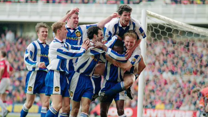
5. Blue/White Stripes (1994 - 1996)
There are iconic moments, good and bad, attached to the blue and white striped third kit of the mid-1990s. United won the Premier League title in it on the final day of the 1995/96 campaign, while they changed into it halfway through a game against Southampton that season.
4. Black w/Green (1998/99)
United’s black change stripes, which have been commonplace since the early 1990s, have typically had red or white trim. But in 1998/99, the attractive black third shirt used a shade of neon green to give it a fresh and rather different look.
3. All-Black w/Rose Graphic (2019/20)
With artistic graphics all the rage in recent years, United’s 2019/20 black third shirt was quite stunning. The all-over rose design was in reference to the club’s 1909 FA Cup shirt, which featured a Manchester rose as the club crest.
2. Green/Gold Halves (1992 - 1994)
United kicked off the Premier League with the mother of all throwback kits, long before ‘throwback’ was even a thing. The 19th century green and gold halves of Newton Heath were reimagined by Umbro and the launch was also a clever replica of early team photos.
1. All-Blue w/White (2008/09)
The all-blue third kit launched for the 2008/09 season to celebrate the 40th anniversary of United’s maiden European Cup triumph in 1968 was just supremely classy. There wasn’t a great deal to it in terms of design flair, but it didn’t need to be anything more and just looked incredible.
For more from Jamie Spencer, follow him on Twitter and Facebook!