Man Utd's most divisive kits ever
- Man Utd's new away kit features green and white stripes
- Kit designers are always seeking bold new ideas
- 90min looks back at some other shirts that have divided opinion

Manchester United have launched their new 2023/24 away kit and the bold design is sure to divide opinion among fans around the world.
The green and white stripes, featuring subtle red pinstripes are an interesting choice. But it is actually steeped in over a century as United wore striped jerseys of varying colours from the 1890s - as Newton Heath - through to the early 1920s. In fact, some of the very first away shirts following the name change to Manchester United in 1902 were green and white stripes.
United say the particular shade of green also represents Manchester's urban landscape - the city itself was also a major influence in the recently released home shirt too.
Blue and white stripes were also an early change kit, but 2023/24 is the first striped jersey the club has used for nearly 30 years - last seen as a third strip launched for the 1995/96 season.
The new kit certainly grows on you, but plenty will be divided over whether they love it or hate it.
Prior to the Premier League era, kits were often more simple or went largeley unchanged for decades at a time. Modern jerseys, which invariably change each season, are much more out there as designers face pressure to push the boat out and create something original every time.
It can occasionally lead to a stinker. But even those shirts that some fans detest, others will have their reasons for adoring. Meanwhile, the passage of time and the rise of the retro shirt market can also turn jerseys that were hated when they were first released into highly sought after cult classics.
Man Utd's most divisive kits ever
1. 1995/96 - Away
United had been wearing the grey kit the day that Alan Hansen declared on BBC Match of the Day: "You'll never win anything with kids." He was proven dead wrong, but the team had been awful in a 3-1 defeat to Aston Villa amid claims the players couldn't see each other very well.
Several months later, United even changed out of it at half-time in a game at Southampton. Yet to buy one today it could cost you up to £200.
2. 2017/18 - Third
A novel idea saw fan input welcomed for the design of the 2017/18 home shirt by adidas. The winning suggestion was a subtle graphic featuring the front of Old Trafford and the Trinity statue of George Best, Bobby Charlton and Denis Law. It was a very nice concept, but did it really work?
3. 2018/19 - Home
United adopted red shirts with white shorts as their primary home kit in 1902 when the club's name was changed from Newton Heath. It stayed that way for 116 years until 2018 when adidas opted to use black shorts to match up with the design of the shirt. Some fans have always preferred the black shorts, but it was certainly a very different look all the same.
These days, the women's team actually use black as their primary home shirts regardless because of player feedback relating to feeling uncomfortable wearing white or light colours during menstruation.
4. 2001/02 - Third
Gold is always a bold move in football because you're there to be shot at. But United certainly had reason to own it at the start of the 2001/02 season off the back of three successive Premier League titles and wanted something special to celebrate 100 years of the 'Manchester United' name.
It was even reversible with the white away jersey, all the rage back in the early 2000s, so you got two shirts for the price of one. On the pitch, its most notable outing was a disastrous day at Highbury against Arsenal.
5. 2004/06 - Home
Nike's 2004 template was present in the home shirt United wore for two seasons until 2006, featuring a central badge, asymmetrical swoosh and both cuff and neckline designs that stood out.
This was the first United shirt that Wayne Rooney wore and the one in which Cristiano Ronaldo took his first real steps towards future superstar.
6. 2022/23 - Third
Last season's bright green third shirt was garish to say the least. It wasn't worn all that much, although it became a very popular choice for fans of the women's team because of a pulsating late 3-2 comeback win over Arsenal at the Emirates Stadium - a first ever away league victory against them.
7. 2014/15 - Home
The last kit that Nike produced for United for the 2014/15 season wasn't a bad one. It had plenty going for it, but the in your face branding from new sponsor Chevrolet didn't seem to sit right and it wasn't the best time on the pitch as the club continued to struggle finding a post-Fergie identity.
8. 2020/21 - Third
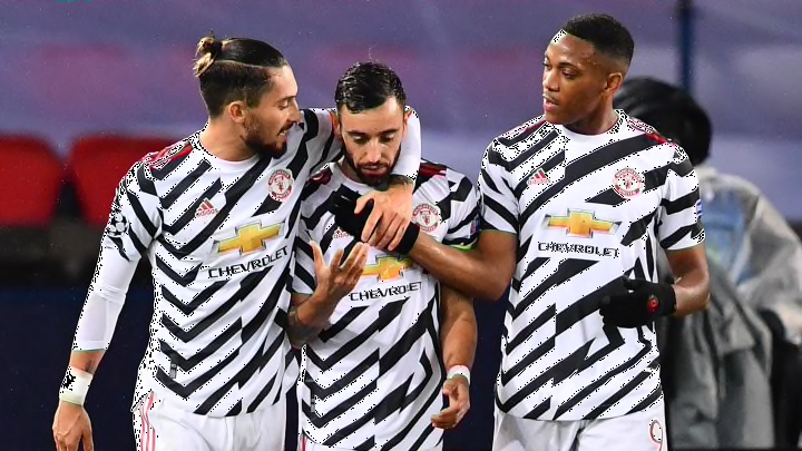
The third kit seen during the 2020/21 season was often likened to a funky zebra. The actual inspiration for the design was 'dazzle camo', the patterning painted onto ships during the First World War that made it difficult for enemies to gauge size and distance. It was therefore a slightly odd choice for a football team when the intention is to find your teammates accurately.
READ MORE ON FOOTBALL KITS FROM 90MIN
manual