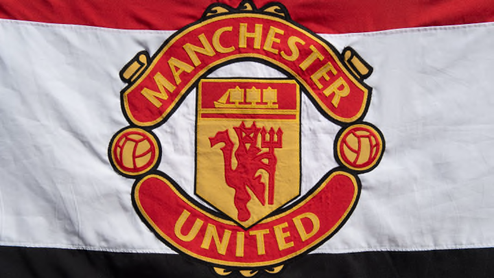
Manchester United badge history: The story behind the crest, colours and design
By Sean Walsh

In a sport full of circles and shields, Manchester United's club crest stands out among the lot.
While not exactly a minimalist design, the Red Devils' badge is iconic and instantly recognisable.
But why does United's logo look the way it does? Has it always looked this way and will the club look to modernise it in the near future?
Manchester United badge history
Man Utd's first logo was designed in 1878 back when they were known as Newton Heath. The badge featured a steam train on a yellow and green pentagonal shield and the club's former name across the top.
After officially becoming Manchester United Football Club in 1902, a modified version of the city's coat of arms was used as their official logo for the next few decades (and still is even today on certain club apparel).
From the 1940s to the 1960s, slightly different versions of a crest not too dissimilar to the current one were used, with two scrolls and two flowers surrounding the same pentagon shape used by Newton Heath. The pentagon incorporated three diagonal stripes and a ship with sails, a nod to the city's coat of arms and an homage shared by neighbours Manchester City. The top scroll read 'Manchester United' and the bottom 'Football Club'.
In 1970, this crest was slightly tweaked to a slicker red and yellow design, replacing the red, white and black used prior, while two footballs replaced the flowers. Just three years later, a red devil was added to the pentagon in the middle of the logo and this largely remained as the official crest of Man Utd for 25 years, with subtle tweaks added from year to year.
In 1998, prior to United's treble-winning season, the club modernised their logo to incorporate more eye-catching shades of red and yellow, while the words 'Football Club' were removed from the crest altogether.
Listen now to 90min's Manchester United podcast, The Promised Land, with Scott Saunders & Rob Blanchette.
One-off logos
Man Utd have sometimes used different crests for special occasions.
During the 1950s and 1960s, United would wear slightly different variants of the city's coat of arms when they played in cup finals, and on one occasion simply used an eagle which resembled Man City's future logo from the late 1990s to the 2010s.
In 1978, a variant of the 1970s logo was used to mark the club's 100-year anniversary, with the word 'centenary' added to the bottom scroll and the pentagon being changed to black.
United have sometimes adorned the crest with a further block shape behind it on their shirts, most notably occurring in the 2006/07 and 2019/20 seasons. This modification is also expected to return for the 2022/23 campaign.
Match-going fans at Old Trafford can also often be seen wearing merchandise that features United's current logo but in the yellow and green colours of Newton Heath in protest against the Glazer family.
Manchester United new logo
Although it was last updated in 1998, Man Utd's logo is one of the oldest in the Premier League.
In an age where anyone can open up Photoshop and create a classy design for themselves, there are plenty of concept designs out there, but the most popular one features the current red devil on a dark red and black circle, with a star poking out of the top.
However, there are currently no public plans for Man Utd to update their official logo.