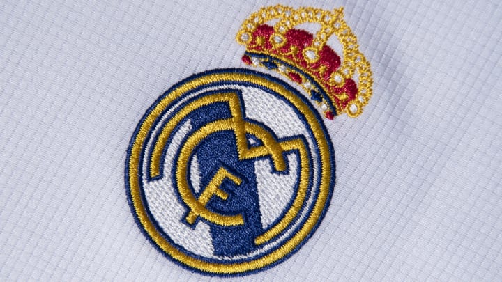
Real Madrid badge: The story behind the crest, colours and design
By Tom Gott

Few images are as universally recognised as the Real Madrid badge. All across the globe, you'll find fans of Los Blancos proudly sporting the iconic crest.
There are so many details which make this badge so famous, but just from where those aspects draw inspiration is not as widely known.
Here is the story of Real Madrid's badge.
Real Madrid's badge history
Real were formed back in 1902 when a number of graduates from Cambridge and Oxford University introduced football to the city of Madrid as part of the Institución Libre de Enseñanza. The natives loved it so much that they formed their own team, called Sky Football, which eventually splintered off into two sides: Sky Football and Nueva Sociedad de Football, the latter of which included the first president in Real's history, Julian Palacios.
This breakaway side would soon change their name to Madrid Football Club and introduced an emblem which was simply just a combination of the letters M, F and C - which would go on to inspire the logos of the future.
In 1908, that badge would undergo a minor change which would see the format of the three letters change into the pattern which is still used to this day.
They would use that until 1920 when King Alfonso XIII awarded the club with the 'Real' (Royal) title. The name was changed to Real Madrid and with that came the addition of the King's crown on the top of the badge, which was all a monotone blue at the time.
The crown, and the Real title, would be removed during the Spanish Civil War, but the badge would then feature a purple band across the design which symbolised Castile, the region in which modern Madrid is situated.
When the war ended in 1941, the crown returned and designers began producing Real's badge in more colour. It was primarily gold, with the purple Castile band still present, and would remain that way until 1997, when gold became yellow and purple became blue.
As far as major changes go, that would be it. The final update came in 2001, with the 'M' widening, the Castile band shortening and the crown being raised slightly above the ring, rather than resting on it.
One-off logos
In 1912, Real would publicly reveal a different logo on which they were named "Madrid" Foot-Ball Club, stamping the crest on an invitation to face Barcelona. We'd see something similar in 1943 as well, but this time, the name read Real Madrid Club de Futbol.
Aside from that, Real's logo has been largely untouched, although it does actually look different these days depending on which country you're in.
As a global brand, Real have removed the Christian cross from the top of the crown in certain countries which could take issue to its presence, continuing with the simple crown instead.
Real Madrid new logo
Despite plans to modernise the Santiago Bernabeu, there are no suggestions that Real will look to update their iconic badge.