The 10 Worst Serie A Kits of the Past Decade - Ranked
By Lee Bushe

The Italian top-flight contains some of football's most iconic kits. The unique viola of Fiorentina's shirt, the iconic hoops in the centre of Sampdoria's shirts, the ever-present cross in Parma's shirts.
But, unfortunately for every great shirt created, an equally ugly one is usually utilised when a team plays away - though the odd home garm has been known to make eyes bleed too.
Here, 90min takes a look at some of the absolute rotters seen over the past decade...
10. Lecce Home (2010/11)
It's quite a feat to screw up stripes, but alas, Asics managed to do it with their horrific effort for Lecce in 2010/11.
The red takes prominence in I Salentini's home strip, with narrower, yellow stripes branching out as they reach the shoulders. The result is quite ugly and messy - which is exacerbated by the fact the kit sponsor logo and Lecce's badge don't quite sit comfortably within the yellow stripes.
2010/11 was a successful season for Lecce, however, as they managed to stay up by five points following their promotion from Serie B.
9. Juventus Home (2019/20)
The kit itself isn't terrible (though the pink stripe down the middle does make it a little fussy) but it makes the cut here by virtue of not really being a Juventus kit. You know, for us purists.
That's because La Vecchia Signora have worn black and white strips since a Notts County fan shipped them over to Turin back in 1903, and the result is a consistently smart, somewhat imposing kit (they say vertical stripes make you look taller) that has become iconic.
So, adidas, back to basics next time round, mkay?
8. Atalanta Away (2013/14)
When it comes to yellow kits, there is a golden rule: don't make the yellow too bright.
If you do, the result might end up looking like Atalanta's away kit from 2013/14. Ideal for cycling home late at night, but perhaps not the greatest choice for a football strip.
Yellow takes precedence here, but the presence of black stripes meant this kit wasn't used very often. Thankfully, Atalanta's grey third choice apparel wasn't too shabby - though this garish kit is the only memorable thing from La Dea's 2013/14 season.
7. Inter Home (2014/15)
Setting aside the horrifically disturbing fact that Inter's iconic blue and black stripes were dropped for 2014/15, this kit - all things considered - is a pretty shocking effort from Nike.
The collar is strange and unnecessary, while the blue pinstripes are barely noticeable, making this, in essence, a black strip.
The changeup didn't do Inter any favours on the field either, as they ended a dreary Serie A campaign just above mid-table.
6. Cagliari Third (2016/17)
There was a weird trend during the 2010s of clubs opting for fluorescent change kits, and Cagliari decided to get in on the act for the 2016/17 season.
Putting the colour aside, which is just awful, the collar is a tad funky - and it extends far too low on the shirt. Couple that with contrasting sponsors and it's an absolute cluster fudge of disaster.
Let's pretend we never laid eyes on it, eh.
5. Inter Third (2016/17)
The question here is how do you adequately describe something so bad?
Bright green and blue, with subtle blue hoops in the green part and subtle green hoops in the blue part? It makes literally no sense. Throw in the Pirelli sponsorship in invisible black and it really is time for a lie down.
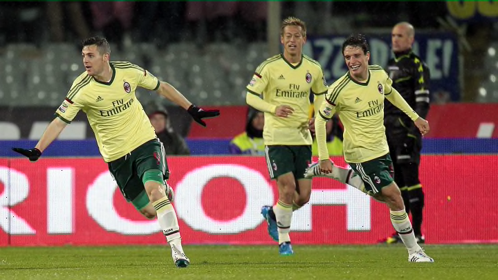
4. Milan Third (2014/15)
Aptly, this was a humiliating strip for the team that was often on the receiving end of humiliation themselves.
Layout wise, it's pretty clean and simple. It would've made for a decent, but forgettable kit if the colour was say, black or even a different shade of green.
Instead, the designers instead went for a colour that sits uncomfortably between yellow and green, and the result was a kit that is still joked by about to this day.
3. Napoli Third (2017/18)
Kappa have done something quite amazing here. They've managed to create a kit that simultaneously stings the eyes and bores the life out of you. This eye burning kit is only made worse by the sponsors, which has ruined many a great Napoli shirt over the last few years.
It's even more of a shame when you consider I Partenopei wore this kit during the 2017/18 season, one of their most successful in recent memory. Still, can't have it all can we?
2. Sampdoria Away (2019/20)
Joma have produced some great alternative kits for Sampdoria over the years, but - unfortunately - this isn't one of them.
For a start, there is an excessive amount of detail on this shirt - blue corners, we're looking at you - while the fade effect just...well, doesn't work. There's also the problem of the central badge sitting about 2.4cm above the main sponsor - which last time we checked, wasn't on the checklist of good ideas.
Time to warm the cockles by looking up a 90s picture of a balding Attilio Lombardo.
1. Napoli Third (2018/19)
When teaching kit design, lecturers should show Napoli's third kit from 2018/19 as an example of everything not to do when designing a football shirt.
First and foremost, is the colour shockingly unpleasant? Yes. Is there are strange pattern on the shirt? Yes. Is the collar too big? Yes. Is it excessively detailed? Yes. Is our logo even visible on the shirt? No.
Not only is this the worst Serie A kit of the decade, but it also might be one of the worst football shirts of all time.