Chelsea badge history: The story behind the crest, colours and design
By Sean Walsh

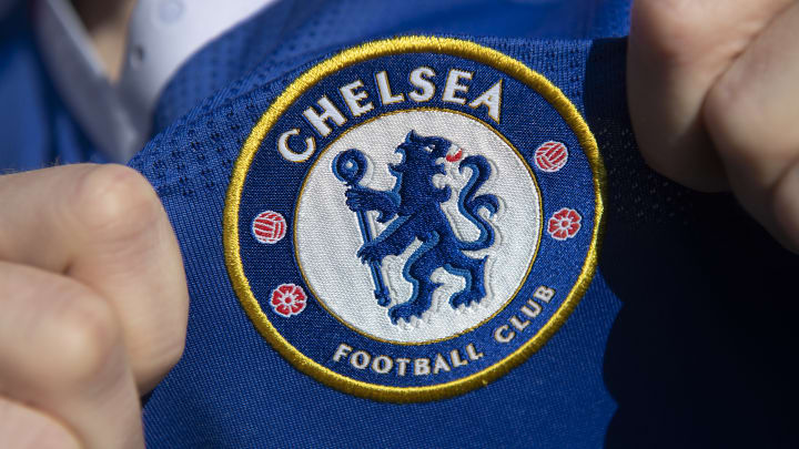
Chelsea are one of England's most successful clubs, and they have a recognisable badge to accompany their stature.
The Blues' logo has gone through a few iterations over the years, but the premise of a lion on a blue crest has been a constant for over half a century.
Here's the definitive history and future of Chelsea's badge.
Chelsea's badge history
Though whatever primary design has always had slight tweaks and variations to it from time to time, Chelsea haven't had too many different versions of their badge.
Their first crest simply included a portrait of a Chelsea Pensioner in the middle of a circle with the club's name wrapped around it. This was used from their formation in 1905 until 1952.
For one season, they switched to a blue shield with the letters 'CFC' branded on them before they turned to a design which resembles their current logo, with a lion holding a staff in the middle of a blue circle. 'Chelsea Football Club' and red roses featured on the outer edge of the circle, while the outline was a bright yellow.
However, Ken Bates' arrival in 1986 saw Chelsea move to a completely new design as their previous logo couldn't be copyrighted (a major reason behind most clubs' decisions to create a new crest). This bold design featured a lion on a solid plain blue circle stepping over a new 'CFC' moniker. Over the next couple of decades, the circle was added and removed several times, while the lion was depicted in red, yellow and white colours too.
In 2005, fan pressure led to Chelsea reverting to a modernisation of their 1950s to 1980s logo, and a variant of this design is still in use today.
Listen now to 90min's Chelsea podcast Wherever You May Be, hosted by Olivia Buzaglo. Each week, Olivia and guests Krishan Davis & Anita Abayomi talk all things blue.
One-off logos
When Chelsea restored their famous lion logo in 2005, it was initially used for their centenary season, featuring gold trim on a blue base.
From the 2006/07 season onwards, the gold was replaced by a royal red and a deeper shade of blue came into play.
Chelsea's home kit for the 2012/13 season saw a similar gold used on the crest again, though this was only to match the trim of their adidas shirt and the official club logo remained the same. Contrary to popular belief, this gold colouring was not used as a nod to their 2011/12 Champions League triumph as the kit had already been decided upon before their European glory.
Chelsea new logo
While their logo was only updated in 2005, Chelsea's logo has already become outdated due to its basic font and plain design.
The club confirmed in recent years that they are looking to find ways to modernise the crest, but there have scarcely been any updates on this front.
The arrival of Todd Boehly may see this issue revisited in a similar way to Bates' arrival in the 1980s but no comment has been made by the club just yet.