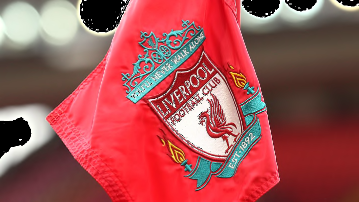
Liverpool badge history: The story behind the crest, colours and design
By Sean Walsh

A global sporting powerhouse, Liverpool's logo features many unique elements to make it stand out from the crowd.
The Reds are already steeped in history and any design they choose would prove to be iconic, but there are so many key details to give it an instantly recognisable look.
Here's the story of Liverpool's badge.
Liverpool's badge history
Like many clubs in the late 19th and early 20th centuries, Liverpool's first official badge was a variation of the city's coat of arms, featuring a triton and Neptune - the ancient god of the sea - flanking a liver bird. A scroll reading 'Liverpool Football Club' was at the foot of the logo.
In the 1940s, the club reverted to a design which retained the liver bird at its core, but was instead used on a largely circular red and white logo with scrolls above and beneath it. Two footballs appeared where the triton and Neptune had previously stood, while further minor decorative features meant that the crest resembled Manchester United's current logo.
The liver bird made its way onto club shirts in the early 1950s, while the official logo saw it stand on a plain red shield similar to Everton's crest shape. However, this design was short-lived and the shield was replaced by a white oval in 1955, with 'L.F.C.' appearing towards the bottom.
In 1968, the oval was removed and the liver bird and the club's initials provided a minimalist badge alone. This iconic look stood until 1987 when a shield and scrolls were reintroduced.
For the Premier League's inaugural season and their own 100th-year anniversary, Liverpool placed a larger shield behind the already existing one and added the Shankly Gates to the top of it it. The words '100 years' were emblazoned across the middle of the crest along with 'Liverpool Football Club', while the scroll instead read '1892-1992'. For the first time, the club's 'You'll Never Walk Alone' anthem name was added to the crest, taking its place beneath the Shankly Gates on a red rectangle.
The following season, notions to the club's centenary were removed and yellow accents were added for the first time. This logo also saw the introduction of two eternal flames in tribute to those who lost their lives in the Hillsborough disaster.
A slicker, modern version of this design came into effect in 1992. Green livery replaced the yellow accents and the inner shield was removed.
From 2012, Liverpool have used a variation of their 1968-1987 logo on their shirts instead of the official club emblem.
One-off logos
As mentioned, Liverpool used a special crest for their centenary season which began the evolution into the design most associated with the club today.
After winning their fifth European Cup, Liverpool's Champions League kit for the 2005/06 season featured five stars above their current logo, supported by gold trim.
Similarly, golden accents were added to the kit's logo for the 2017/18 campaign to celebrate the club's 125th-year anniversary.
Liverpool new logo
As of May 2022, there has been no public intention for Liverpool to alter their badge or introduce a new one.