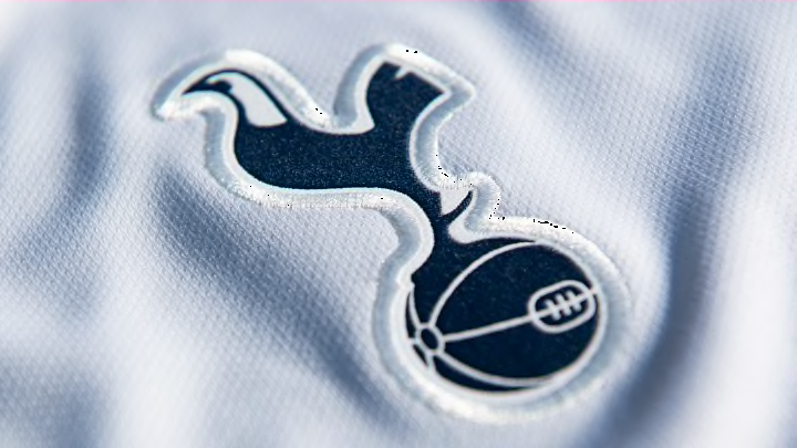
Tottenham badge history: The story behind the crest, colours and design
By Sean Walsh

As a certain north London club will tell you, there is only one Hotspur in a world full of City's, United's, Town's and County's.
Tottenham's brand and blue-and-white colour scheme are easily recognisable and identifiable. Their club crest is no different.
Here's everything you need to know about the past, present and future of Spurs' badge.
- The story behind Arsenal's badge
- The story behind Chelsea's badge
- The story behind Liverpool's badge
- The story behind Man Utd's badge
Tottenham's badge history
Tottenham's badge is tied heavily to the club's origins all the way back in 1882 when they were formed as Hotspur FC, an affiliation of a local cricket club of the same name.
They were named after the famed English knight Sir Henry Percy, who was nicknamed as Hotspur and dug in his spurs to make his horses run faster into battle. With spurs also known for their association with fighting cocks, a bronze cockerel was erected onto White Hart Lane's west stand for the 1909/10 season.
Tottenham's first emblem - introduced for the 1921 FA Cup final - featured a navy blue rooster on a white shield with further navy trim. This badge stood for over three decades until a rounder shield and leaner cockerel came into effect from 1951 after the club won their first Division One title.
From 1971, the shield was removed and the cockerel became much thinner, while it was now standing on a pretty big old-fashioned leather football.
In 1983, Tottenham introduced a more complicated logo in order to fight a rise in pirate merchandising.
A cockerel which resembled the one standing atop the west stand was the centrepiece on a heraldic navy shield, while it stood on smaller shield baring the club's 'THFC' initials. This second shield was flanked by two red lions - a controversial choice given red is largely associated with rivals Arsenal. Local landmarks were also represented on this design, with a castle representing Bruce Castle and seven trees a nod to Seven Sisters. A scroll reading the latin translation of their 'To Dare Is To Do' motto is placed at the bottom.
Variations of this crest were used until 1999 alongside a more simplistic badge using the cockerel and red lions standing above the scroll, though the ball was replaced with a circle featuring an altered version of the club's initials. This logo stood for another seven years after the shield crest was retired.
In 2006, Tottenham unveiled a slick, modern and minimalistic logo featuring a leaner cockerel standing atop a leather football again, though this time the ball had more realistic proportions. The club's name officially appears at the bottom of the logo and wrapped around the ball, though this is omitted in certain media and on kits.
Listen now to Oh What A Night, 90min's Tottenham Hotspur podcast. Every week, Sean Walsh and Jude Summerfield discuss all things in the world of Spurs.
One-off logos
For Spurs' 125th anniversary in 2007, the words '125 years' replaced 'Tottenham Hotspur' beneath the ball.
Nike's first year as Tottenham's kit manufacturer - the 2017/18 season - saw them reintroduce the shield used from the 1920s onwards, though with the modern cockerel and ball standing in front of it.
The 2021/22 campaign marked the 100th year of Spurs using a cockerel and the first logo used by the club was placed on the inside neck of the home shirt.
Tottenham new logo
Tottenham currently do not have any plans to introduce a new logo or make amendments to their current one.