The Weird & Wonderful Kits From the Inaugural 1996 MLS Season - Ranked
By Mitch Wilks

Major League Soccer was, and sort of still is, one wildly mysterious slice of the football pie that we can't seem to get our heads around.
While today the American top flight operates on a much more credible level than it used to, this was nowhere near the case in it's early years. Reminiscent of a dwindling World Championship Wrestling in 1999, it was completely and utterly bonkers.
Before a rule in 2005 forced all teams into adidas kits, MLS had no regulations on their kits. Combine unrivalled American creative freedom and lack of sponsoring with typical 90s fashion, and you'll get a sense of where this is going.
On-pitch regulations were already wild enough to begin with, for example the infamous running penalty concept, but the kits that teams donned on the pitch were equally as intriguing.
So, in good old 90min tradition, here they are in their glory, ranked from worst to best.
10. Colorado Rapids
There's some football shirts that get away with being so bad that they're terrific. This isn't one of them.
An incredibly boring effort from Puma with the only highlight being the massive badge in the centre. But that's it. Awful colours and an awful season too, as the Rapids finished last in the overall standings.
9. DC United
Winners of the first ever MLS Cup, second bottom in our kit rankings.
While some adidas-endorsed teams were being kitted out with some of football's most iconic jerseys to date during the 1990s, DC United received this boring effort.
Bog standard, which scores no points in a list like this.
8. Kansas City Wiz
Now better known as Sporting Kansas City, which is more professional but much less exciting, the Kansas City Wiz had a tough go of it here.
It's incredibly unique and very fitting for the time, but it also looks like something you'd use to clean the house in and nothing more.
7. Columbus Crew
The Crew benefit here from having potentially one of the best badges in football, and a colour scheme that is difficult to make look bad.
It looks average at best here. Nothing too offensive, but for the inaugural season of a brand new first division project, it's very Sunday league.
6. San Jose Clash
Now the Earthquakes, the San Jose Clash made their MLS debut in an audacious jersey.
Half and half kits are great, unless one half is a vomit green colour. Not even John Cena could pull that shade off.
5. New England Revolution
Now this is audacious. And it's done absolutely right.
For Reebok's only involvement in the 1996 MLS season, they supplied the New England Revolution with a striking design that's perfect for any UK music festival.
Huge badge half way down the shirt, combined with a crazy graphic that occupies the top half. Incredibly bold, but not the best.
4. New York/New Jersey Metrostars
Fourth place could have looked much more like ninth or tenth for the Metrostars because of that ridiculous name, but thankfully the kit was a solid effort.
Nike's MLS template this year was spot on, and it worked much better with some more uniform colours. As for the hyphenated club name? The less said the better...
3. Tampa Bay Mutiny
Third place in this list goes to a team who unfortunately no longer exist.
The Tampa Bay Mutiny only played from 1996 until 2001 before dissolving in 2002, but debuted in MLS with a cracking kit. And Carlos Valderrama.
An improvement on the vomit green colour used by San Jose Crash, the Mutiny used green as the base and accented the shirt with shades of blue. The bold sleeve design and the font in the centre of the jersey really do it though, as the Florida-based outlet went full alien theme for this one.
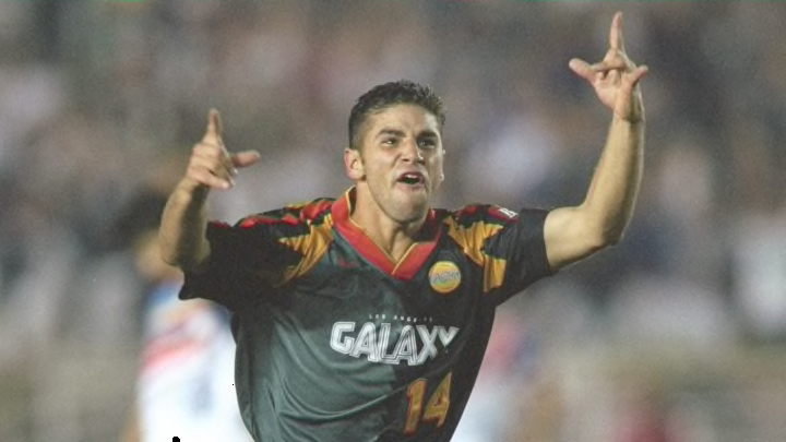
2. LA Galaxy
The most successful MLS side to date, the Galaxy skyrocketed in prominence when David Beckham joined in 2007 from Real Madrid.
They were destined for success straight from the off when they debuted with this belter of a kit. The sleeves are wonderful and reminiscent of something Jorge Campos would've loved. The colours in the two tone design are classy, and the massive v-neck and centre badges are totally unnecessary. Perfection.
1. Dallas Burn
The only thing that could knock the Galaxy off the top spot is something so ridiculously 90s it hurts.
And this is it.
Dallas Burn, now FC Dallas, debuted with a spectacular effort that combined red, white and black better than ever before. The colours are immense, and there's a giant, fire-breathing mustang in the middle of it all. How does that not get first place?