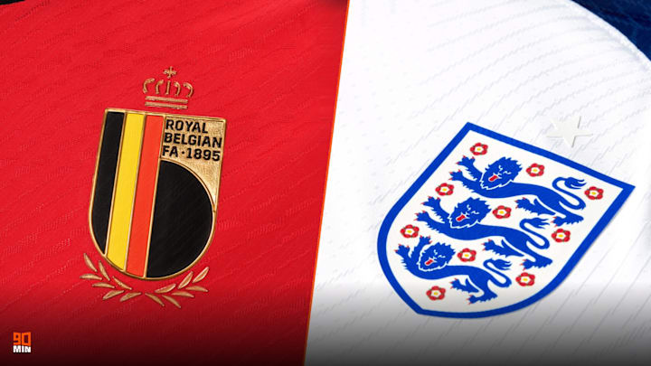
A World Cup taking place in the middle of winter is bad enough. A World Cup with horrendous kits is abominable.
All in all, we might have to stick a big fat asterisk next to this winter's tournament. There's no saving it.
Here are our picks for the worst kits at the 2022 World Cup.
12. Serbia (away)
Serbia 🇷🇸 2022 World Cup Kit pic.twitter.com/8odMFfqaQ9
— GhStandard.com (@GhStandard) September 18, 2022
For the most part, Puma's home shirts for the World Cup are rather inoffensive.
The same can't be said of their away designs. Why does Serbia's kit look like a chocolate wrapper?
11. USA (home)

Nice try, Nike. American fans aren't going to be more interested in soccer just because you made their shirt look like a NFL jersey.
10. Uruguay (away)
Uruguay 🇺🇾 2022 World Cup Kit pic.twitter.com/mD9vuZbRHC
— GhStandard.com (@GhStandard) September 18, 2022
Cut off the sleeves of Uruguay's away kit and you have a NBA jersey. Keep them on and you get a crap football strip.
9. England (home)

You know when a pen explodes in your bag and the ink gets all over everything? Yeah, that's the England home kit.
8. Croatia (home)

HOW DO YOU GET CROATIA'S HOME KIT WRONG. IT'S LITERALLY JUST RED AND WHITE SQUARES. YOU DON'T NEED TO DO ANYTHING ELSE.
7. Spain (away)
🚨 OFFICIAL: Spain’s new away kit for the World Cup. 🇪🇸 pic.twitter.com/bMZOqUPLMo
— Football Tweet ⚽ (@Football__Tweet) August 30, 2022
I'm speechless. As in, I literally have no words. It's unbelievable. Beyond belief.
6. Canada (home)

Canada will head to their first World Cup in about 300 years without a new kit from Nike.
That would at least be passable if they were any good, but Les Rouges have been lumbered with training wear.
5. Argentina (away)
💜😍💜🇦🇷 pic.twitter.com/uHH1S6agW2
— Selección Argentina 🇦🇷 (@Argentina) August 29, 2022
The worst part about Argentina's away kit is it was so close to being a classic.
Purple with lighter accents? Sign us up. Purple with flames? Why???
4. Netherlands (home)

Things the Netherlands home top looks like:
- Velvet
- Those cushions with reversible fur when you swipe your hand across it
- An old rug from the 1980s
Things the Netherlands home top doesn't look like:
- A Netherlands home top
3. Switzerland (away)
Switzerland 🇨🇭 2022 World Cup Kit pic.twitter.com/IFXfkPJRBo
— GhStandard.com (@GhStandard) September 18, 2022
You know things are bad when a Switzerland kit isn't a big plus.
I'm here all week.
Anyway, their changed strip for the World Cup looks like a FIFA 98 loading screen. And not in a good, nostalgic way.
2. Portugal (home)

I was astounded to discover there were actual fans of Portugal's strange home kit, but I'm standing my ground - the Selecao should always wear a dark burgundy with gold trim. None of this split rubbish with green shorts.
1. Belgium (home)

Belgium are threatening to bring the game into disrepute by rocking up to the biggest sporting event in the world dressed like they're heading to a year 5 disco.
They must be punished for this unforgivable misdemeanour.
