West Ham's 10 Best Away Kits of All Time - Ranked

You'd think West Ham jerseys are pretty simple to make. Bit of claret here and a bit of blue there, and voila. But it's not quite that easy. It's a colourway that is steeped in tradition and pride and quite frankly has to be done right.
From the Thames Ironworks to the London Stadium, the Hammers have undergone a dubious re-branding over the past century, but there is one thing that fans remain proud of, and that's their iconic kit.
This year marks the 125th anniversary of the club, and as an homage to the golden era, the Irons have released an away kit inspired by their swashbuckling 60s side.
There's been some beautiful releases, as well as the odd howler or two over the years. Without further ado, here's a look at the ten best Hammers away kits of all time.
10. Farewell Boleyn (2015/16)
2015/16. A season when watching West Ham was pretty riveting. In their final season at the Boleyn Ground, the Irons went hammer and tong with the big boys to surprisingly great effect.
This is the away kit they sported that season modelled by the majestic Dimitri Payet, the driving force behind their seventh placed Premier League finish.
The top half features a very cool meshed design with a horizontal stripe that binds the kit together. It's clean, fresh and smart. Shame about the ugly sponsor though.
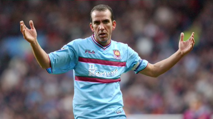
9. A Pinstriped Delight (2002/03)
This one surprisingly divides opinion. The lack of blue doesn't exactly scream Irons, but it's a cracker nonetheless.
Just look at that collar and those sleeves. No heat tech skintight design here, just a proper bit of clobber held together by a wonderful sponsor.
Despite their lavish looking away number, the Hammers were relegated this year. Probably why everyone hates it.
8. Another Cracker From Fila (2001/02)
A season prior to their pinstriped efforts, Fila released this peach of an away kit. The two claret stripes across the front are an homage to the old school 60s, a nice touch.
A young Jermain Defoe was smashing in the goals as he emerged alongside the likes of Michael Carrick and Joe Cole. They were exciting times for the Hammers as they finished seventh, only to get relegated the following year in classic West Ham fashion.
7. Macron's Best Effort (2010/11)
Ahh, the Macron era. The pain of relegation to the euphoria of bouncing straight back up. Scott Parker was on a mission (as demonstrated in the image above) to keep the Hammers afloat, but it wasn't enough.
At least they had a nice away kit though. In a modern twist on a classic, two horizontal stripes run across the middle, one claret and one blue. It looks fresh and vibrant against a white backdrop with claret trimming.
The beloved old badge pops beautifully against the white. A cracking effort from Macron.
6. Dagenham Days (1995/96)
Feeling nostalgic yet? It doesn't get more cult classic than the Hammers in the 90s sponsored by Dagenham motors.
This is perhaps Pony's finest crack at a West Ham shirt. The traditional double striped design is finished off with claret trimming and an iconic sponsor. A proper classic.
5. Reunited With adidas (2013/14)
Apologies in advance to all the retro boffins, but we need to talk about the 2013/14 away kit because it's a future classic.
West Ham have a history with adidas that dates back to the early 80s. They were beautifully designed back then and this one is no exception. The subtle vertical striped design is a throwback to the 1983/85 kit and it looks great here.
The whole things looks fresh and modern and that badge against the white is a thing of beauty.
4. Avco adidas (1985/87)
At the beginning of the 80s West Ham signed a sponsorship deal with leading German sports brand adidas. This was the the third release in a series of kits which spanned from 1980 to 1985 and boy it's a beauty.
The horizontal pinstripes are a delight, as is the old school adidas logo. It's simple yet beautiful. West Ham were flying at the time too, finishing third in the league.
3. adidas (1983/85)
**Kit Chronology**
— West Ham Signed Shirts (@WHUsigned) July 10, 2020
West Ham kits throughout the decades.
1983-85 Home and Away Shirts.
Home shirt signed by @TonyCottee9 pic.twitter.com/MaG68mvFRr
The second addition during adidas' early 80s tenure. It was the first we saw of the vertical pinstripes and it looks mightily smart.
This kit will be forever associated with Tony Cottee's breakthrough season for the club, and what a kit to do it in.
2. adidas' First Involvement (1980/83)
adidas' first crack at a West Ham away kit was definitely their finest effort to date.
A minimalist block white design is complemented by a simple yet effective claret trimming. The blue detailing against the claret striped shoulders are magnificent, as is the collar. A true symphony of brilliance.
Not sure about the short shorts though.
1. Golden Era (1960s)
**Kit Chronology**
— West Ham Signed Shirts (@WHUsigned) July 7, 2020
West Ham kits throughout the decades.
Early 1960s home and away kits! pic.twitter.com/zETbAqHW3e
The mother of all West Ham away kits, as worn by the likes of Bobby Moore, Trevor Brooking, Geoff Hurst and Martin Peters.
Under legendary manager Ron Greenwood, the Hammers lifted FA Cup in 1964 before winning the European Cup Winners' Cup the following season. It was undoubtedly the most glamorous period of West Ham's 125 year history.
The iconic two-stripes were launched during this era and it has become a blueprint for future away kit designs. West Ham have had a tough time with hideous sponsorship over the past decade, but Hammers fans will look back at this work of art with real pride.